Log my Care
Product + UI + UX

Creating a 'smart' electronic care plan for social care managers
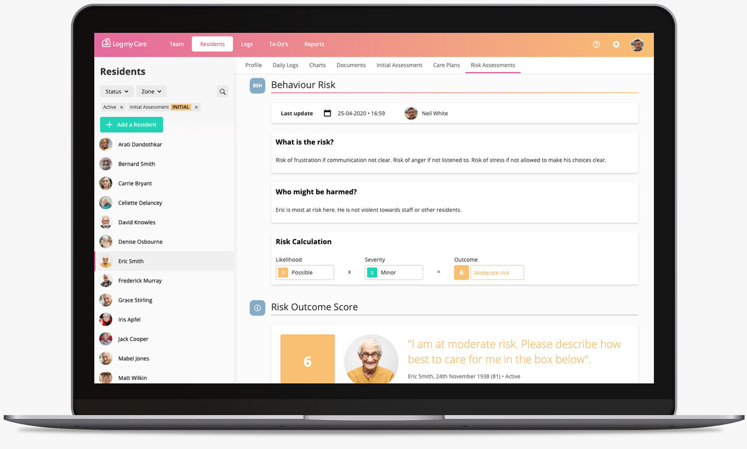
Log my Care (LmC) is a multi-award-winning tech startup serving the social care sector. The core product is free to use, while optional premium modules allow users to build their own system based on what features they need. This novel approach has proved very popular with their growing customer base. I was commissioned to design their biggest module; a digital care plan and risk assessment tool, and a key product offering and revenue generator.

The challenge
With a lack of concrete guidance from the Care Quality Commission (CQC) and other regulators, over-stretched care managers are often left with little time to write these essential plans, often working off templates they’ve put together themselves. It was imperative we delivered the following;
• A best-practice care plan journey fit for all care settings
• Reduce complexity and eliminate repeat processes
• Make it intuitive to use – little or no training required
• Integrate with the existing product architecture.
My role
I was responsible for all user centred design activities on this project. This included creating user research documents, building user flows and prototypes, and undertaking site visits for usability testing, as well as designing the user interface. I liaised closely with Log my Care’s CEO Sam Hussain, and CTO Adam Hurst. Clinical care consultants, Allyson Prince and Stuart Prince advised on compliance and wrote the final clinical content.

What’s a care plan? And what are risk assessments?
Every single person receiving care in the UK is required to have a care plan, so they can enjoy the highest quality of life possible. It records everything about them, from vital medication needs, mental and physical well-being, communication, diet, personal care, preferences and beliefs to their end of life wishes. An Initial Assessment is carried out to assess whether a particular care setting (ie: a care home) can meet a person’s needs. If they do, a Care Plan must be created within a set time period of them being admitted to the home, and then regularly reviewed and updated. This is what Risk Assessments are used for. They inform and shape each care plan review.

Mapping the landscape
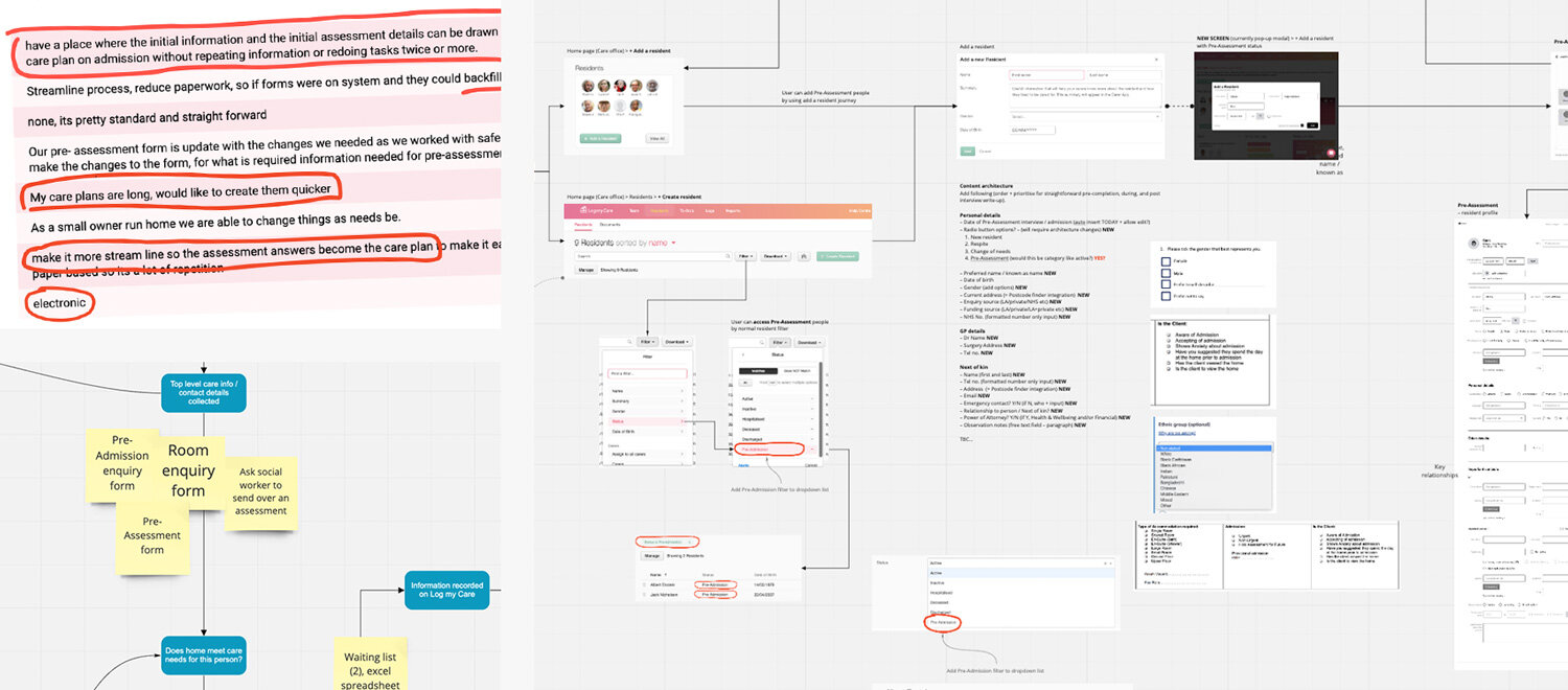
I worked with the LmC team to learn about the current product, its architecture and gain some company background. With this knowledge, I began mapping out a high level view on how best to integrate this large module within the existing product. As I was going to be working largely remotely throughout this project, I used Miro to collate my discovery phase ideas. It’s a great tool for realtime collaboration and allowed visibility to all stakeholders.

User research
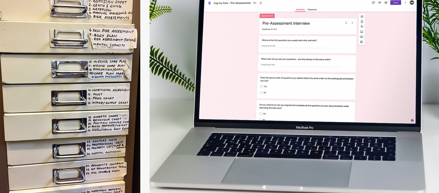
I examined the current paper processes used by LmC customers and noted what information was being recorded, and why. Every customer had a very different structure when it came to Initial Assessments. What was common was repeated information duplicated across various forms. Care Plan formats were more standardised, and some Risk Assessments were common as they were licensed documents.
Our users were widely spread across the country. It didn’t make sense at this stage to burn time and budget travelling. I created a Google Form to test assumptions, and we identified customers who would give a good spread of feedback and insight. We received a 100% return rate despite offering no cakes or vouchers! (sorry) – a great testament to the loyalty LmC had built up with their users.
"If my initial assessments were to create my care plan for me… that would be the most wonderful thing."
– Care Home Manager
Information architecture
This initial feedback proved useful in shaping what would become a pivotal approach to our ‘smart’ Care Plan and Assessment process.
The main challenge was on how to get everyone’s very different Initial Assessments into one best-practice format. Then how we could save them a huge amount of time by structuring this into a working Care Plan. By design, they’re quite different types of information formats.
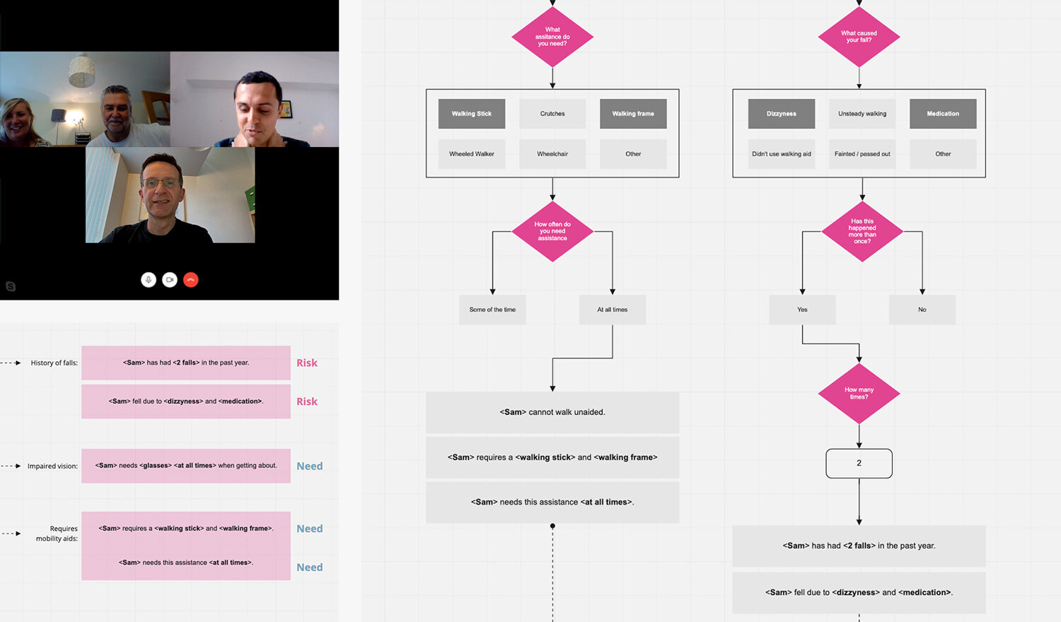
I mapped out my thought process on how we could convert a simple user input selection into a written statement fit for Care Plan compliance. It’s worth noting CQC does not like documentation that is formulaic – we still needed to adhere to what is core within social care, ‘person-centred care’, meaning it’s written precisely and exclusively for each individual.
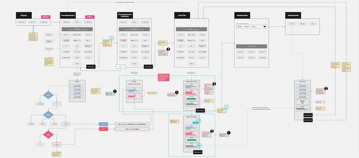
Wireframes and prototype
A series of wireframe journey revisions were developed into a low-fidelity prototype, enabling a walk-through of the entire user journey. Throughout this process I liased closely with the LmC leadership team. Once we were happy, we shared the outcome with our clinical consultants for feedback on the overall process.


User testing
I visited several care homes to gain first hand feedback on our prototype from managers and heads of care. Users were observed navigating the prototype (where it was more complete and usable) and feedback was sought in areas where we required further validation.

“Can we have this now?“
– Head of Care / testing participant

Feedback was divided into three areas and reported back to LmC.
Workflow
We’d allowed for a flexible workflow within our proposed solution to accommodate different working practices. All users identified with the overall approach – it reflected familiar procedures. They also recognised their inputs at the initial stages would materialise in the later stage care plan. This aspect was very well received.
Navigation and control
Users liked the connectedness of the whole process, especially for traceability and evidencing care. There were consistent issues when observing users saving ‘in-progress’ documents, and also some buttons seemed outside their main focal area. This was easily fixable with some improved UI design.
Content
Until now, users had been used to their own paperwork versions. It was essential they could accept and work with our proposed template and process. As soon as they realised the time saving advantages, as well as the opportunity for much improved accuracy, many were ready to throw their current paperwork away there and then.
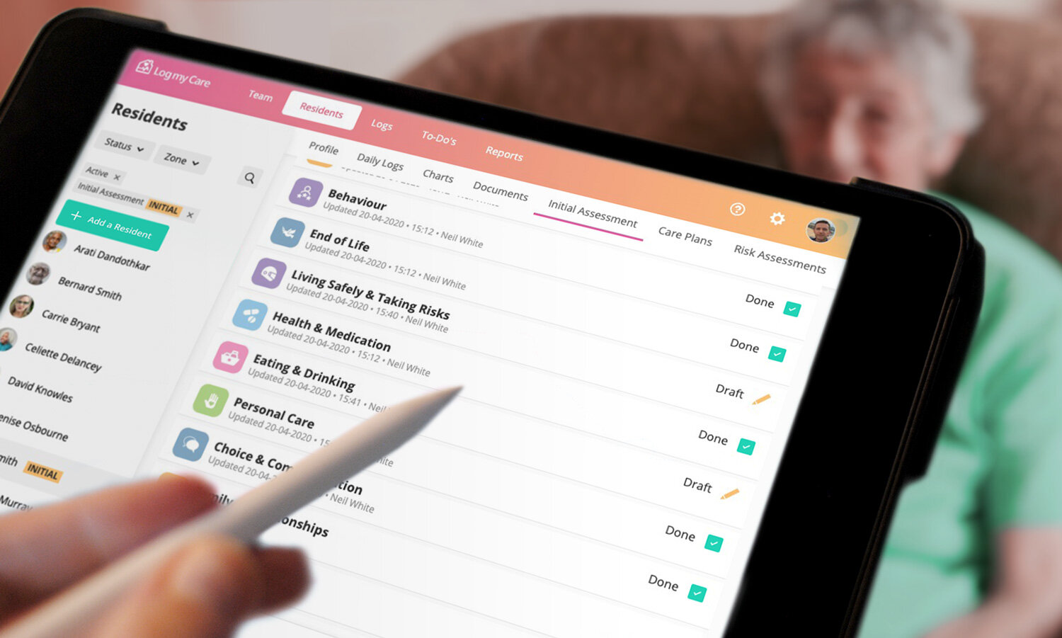

User interface design
Log my Care already had a distinctive look and feel across their current web and app products. I was keen to develop it further, but also mindful of the work involved for such a small dev team. I worked closely with the CTO and front-end dev to establish what were easy wins for us, and what would create unnecessary work.
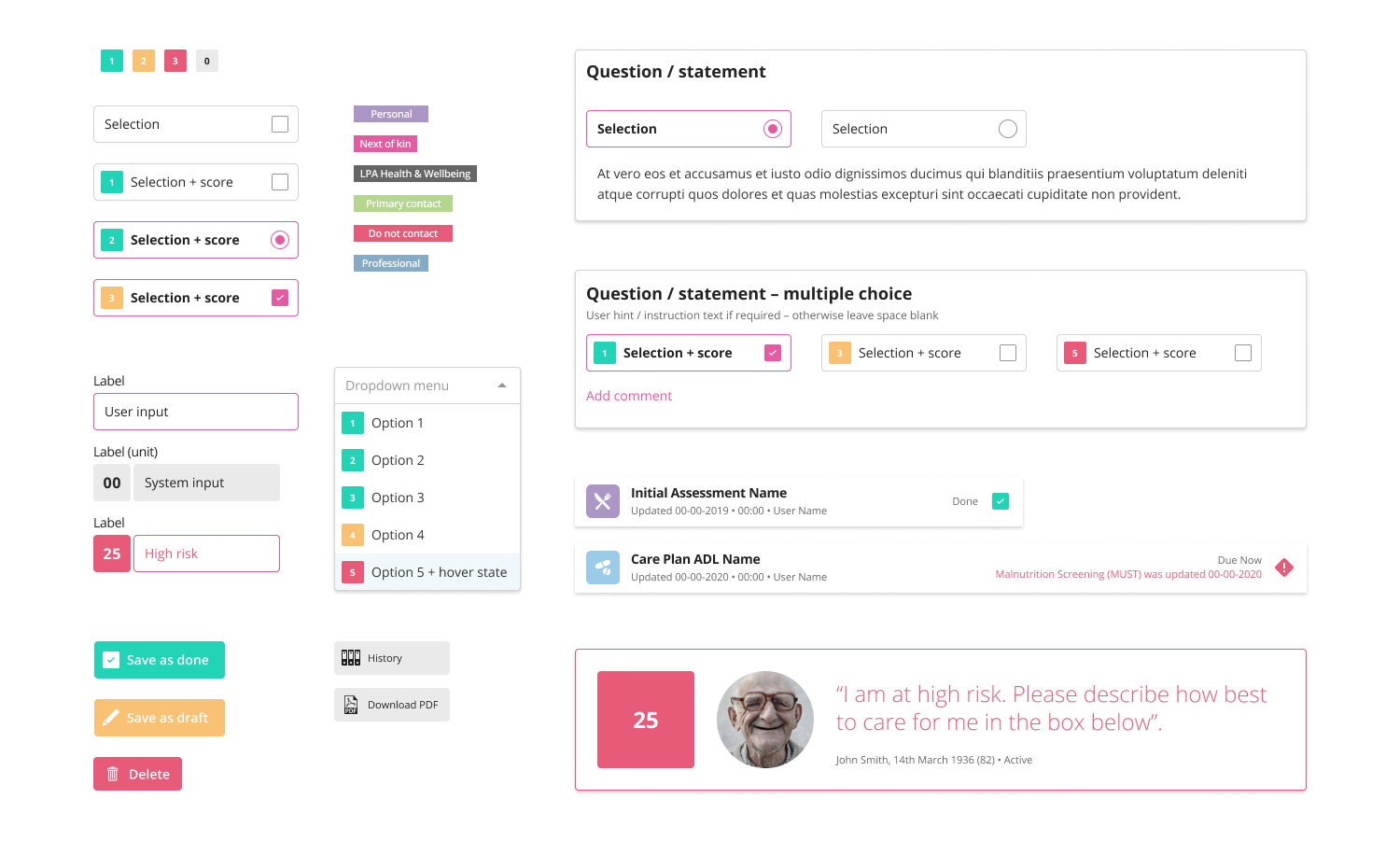
Establishing a component driven UI
With so many new screens, it made sense to establish a component approach to make the build, deployment, and future releases more efficient. We used Figma so we could easily collaborate remotely, and discuss design and build details in real-time. The design components have since been adopted by the core LmC team and expanded to a pattern library.


"I'm saving about 80% of the time it used to take…"
– Care Manager

Beta release & early customer feedback
The LmC team handled this stage of the project and shared the results with me. Early feedback was very positive, and adoption metrics appeared to be very encouraging, especially on the Risk Assessments. There were some initial customer support queries regarding particular Assessment names, and a few comments around ‘learning’ the system, but this was largely due to some users adapting to change.
