


Brand + Copy + POS
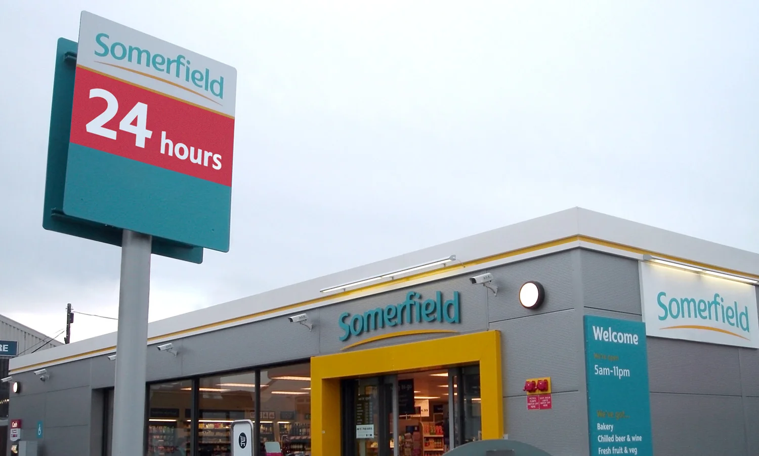
Somerfield had a tired and disjointed look across their estate of 700+ stores, and the new venture capitalist group owners wanted to smarten up their investment. Market research had led to a new positioning as the ‘local friendly high street grocer, which needed to be better and more consistently communicated to customers through an improved brand look and feel.
I was tasked with designing a more informative and modern graphic identity. Each store service featured prominently within this, using a friendly tone of voice to reflect the new brand direction. As no two stores were identical, I developed a cost-effective modular design system to maintain graphic consistency. Working closely with the Head of Store Formats, I undertook multiple site visits, researching footfall and traffic viewpoints, as well as store layouts. I presented the final work to Somerfield’s senior management, and also briefed external sign contractors using a guidelines manual I'd designed and written.
The new messaging was rapidly rolled-out across the UK to very positive customer feedback. Footfall increased by 32% as store services and opening times were clearly communicated to passers-by. Somerfield was later sold to Co-op Food as a tangible asset following much a improved financial performance.